Mobile-First Design: Why Your Website Must Be Responsive
Discover why mobile-first design is crucial for your website's success and how responsive design enhances user experience and SEO.
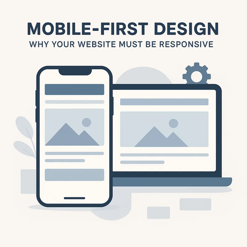
Mobile-First Design: Why Your Website Must Be Responsive
In today's digital age, where smartphones and tablets dominate browsing habits, the importance of mobile-first design cannot be overstated. As more users access the internet via mobile devices, businesses must adapt to this shift to remain competitive. A responsive website design ensures that your site looks great and functions well on all devices, providing a seamless experience for users.
Understanding Mobile-First Design
Mobile-first design is an approach that prioritizes the mobile user experience during the website development process. Instead of designing for a desktop and then scaling down for mobile, designers create the mobile version first. This method encourages a more streamlined, user-friendly layout that caters to the needs of mobile users. By focusing on mobile-first design, you can enhance user engagement and reduce bounce rates, which is crucial for maintaining a strong online presence.
At Shreekedar, we specialize in website development that embraces this modern approach. Our team understands the nuances of mobile design and works to create responsive websites that not only look stunning but also function flawlessly across all devices.
The Importance of Responsiveness
A responsive website adjusts its layout based on the screen size and orientation of the device being used. This flexibility is essential for several reasons. Firstly, Google prioritizes mobile-friendly websites in its search rankings. If your site isn't responsive, it may be penalized in search results, making it harder for potential customers to find you. By investing in responsive design, you're not just enhancing user experience; you're also improving your SEO performance.
Moreover, a responsive design can significantly impact your conversion rates. Users are more likely to engage with a site that is easy to navigate on their mobile devices. Whether you're running an e-commerce platform or a blog, a responsive design can lead to higher sales and increased user retention. For businesses looking to establish a robust online store, our ecommerce website development services can help you create a mobile-friendly shopping experience that converts visitors into customers.
Enhancing User Experience
User experience (UX) is at the heart of mobile-first design. A well-designed mobile site should load quickly, have intuitive navigation, and provide easy access to important information. According to studies, users are more likely to abandon a site that takes too long to load or is difficult to navigate. By focusing on UX, you can ensure that visitors stay longer on your site, leading to better engagement and potential sales.
Our UI UX design services are tailored to create an enjoyable experience for users, regardless of the device they are using. We believe that a great user experience is essential for building trust and encouraging repeat visits.
The Future of Web Design
As technology continues to evolve, the importance of mobile-first design will only grow. With the rise of voice search and smart devices, businesses must be prepared to adapt their online presence accordingly. A responsive website not only caters to current trends but also positions your business for future developments in web technology.
In conclusion, adopting a mobile-first design approach is no longer optional; it's a necessity. By ensuring your website is responsive, you can enhance user experience, improve SEO, and ultimately drive more conversions. If you're ready to take your online presence to the next level, consider our WordPress development services to create a site that meets the demands of today’s mobile users. Don't let your website fall behind; embrace mobile-first design and watch your business thrive.
Explore Our Services
- Website Development - Conversion-focused business websites built for speed and SEO.
- Ecommerce Website Development - Scalable online stores with secure checkout and growth-ready architecture.
- Wordpress Development - Custom WordPress builds, theme optimization, and plugin integrations.
- SEO Services - Technical audits, on-page optimization, and content strategies that rank.
- UI UX Design Services - User-centered interfaces crafted for clarity, conversion, and delight.